Showing posts with label 24 Works 2013. Show all posts

Monday, September 23, 2013

Residual Images: 24 Works on Paper Artist Marcus Kesler

Interview by Jessika Davis, OVAC Intern
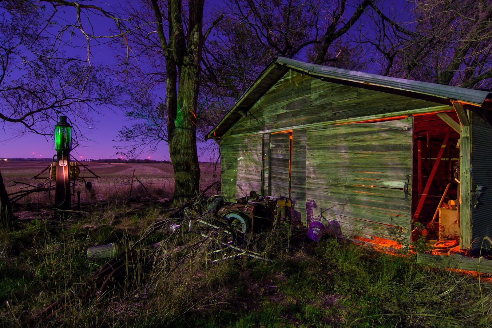
Marcus Kesler, Edmond, Self Service, Photography, 16” x 24”
Photographer Marcus Kesler gives a perspective of Oklahoma agriculture in Self Service. This photograph is from a series that Kesler said “explores the agricultural roots of Oklahoma and the struggles faced by Oklahoma farmers.”

Kesler captured the image with long exposures and painting with light. He focused on the equipment that the farmers used and the land, hoping to draw attention to the relationship between the earth and farmers themselves.  

You’ve expressed your knowledge and support for Oklahoma agriculture. Could you elaborate on why you represented that in this series? Do you have a personal connection to Oklahoma agriculture?
Agriculture is an integral part of the Oklahoma economy and is deeply rooted in our history. It is represented in our state seal, our state motto and throughout popular culture. Many people who have never been to our state ‘know’ that we are an agricultural state after watching “Oklahoma!” I feel that the connection between the people and the land is a powerful symbol of the struggles that both have endured throughout the history of our state and I hope to capture that connection in this series.

The impact that agriculture has on our state is easily visible by driving across our highways and byways and looking at the fields and towns impacted by it. We can see remains of farms and towns that became victims of the Great Depression and the Dust Bowl, and now we can see farms and towns that are still struggling with the Great Recession and the drought that we faced over the last few years. Documenting these struggles, and with the resiliency of the people of Oklahoma in the face of adversity, is the goal of this series. The people have broken the soil, and at times the soil has broken the people.

What inspired you to alter the colors in this piece? Was there a reason why you chose the particular colors?
The colors I use to expose my photographs depend on what I am feeling while I am on location. I try to spend some time just walking around and exploring the scene to get an understanding of the emotions that are present. I try to form a dialog of what might have happened here in the past and what might have caused people to abandon or neglect an area. Some locations have a feeling of sadness and tragedy, while others have a sense of happiness remaining even though people have moved on long ago. At other times I try to use colors to fill a void that has been left behind by the people that have moved on.

In this particular piece I tried to highlight the symbols of the work done by this family, relying on their machinery to work the fields and using their own skills to maintain the equipment that would help them work the earth. I chose orange as a brighter color because it felt like this garage belonged to somebody that enjoyed and took pride in their work.

This artwork is featured in the 24 Works on Paper exhibition on exhibition at Redlands Community College  during August and September, 2013 and touring Oklahoma through December 2014. See venues and more information at www.24works.org. 

Wednesday, September 4, 2013

Cultural Symbols: 24 Works on Paper Artist David Knox

Interview by Jessika Davis, Summer OVAC Intern

David Knox, Oklahoma City, Quarter, Photography (Archival pigment print with oil and varnish), 22” x 16

David Knox is an Oklahoma City-based photographer that offers “Southern interpretations” in his piece titled Quarter, taken around New Orleans, Louisiana. This piece is a part of the Indigenous series that delivers Southern stories, among other collections, of “religion, resurrections, home, ritual, the fleetingness of life and the permanence of death.”

According to Knox, influences for this piece are taken from his interests in Flemish Baroque paintings of hunting scenes and game from the 16th Century and American still life painters of the late 19th Century.

You’ve communicated that this piece symbolizes a list of “Southern interpretations.” Could you describe how each are represented in this piece?
As Flannery O'Connor once said about her native home "The South is Christ-haunted".  Religion is a major theme that runs throughout the American South and also through my work.  Christian iconography, both literal and metaphorical, is found throughout the region and I incorporate these symbols into my pieces as I feel they are a necessary component in the telling of the Southern story.  In Quarter, the fish, an ancient and important symbol of Christianity, represent the influence of the church, of Christ and of his followers on the South. The traditions and rituals specific to the rural South, more particularly those of southern Louisiana, are conveyed in the piece through the form of taxidermy. The fish, now dead, swim upward in a broken line representing the Christian hope for redemption, salvation and ultimately eternal life in Heaven. They are also depicted as partially transparent symbolizing our spiritual transgression from this world below to the next one.  The themes of the past and of loss, pervasive in the South, are evident in the building itself - once beautiful and functioning, now shuttered and in decay. Lastly the ephemeral nature of our time on earth is represented by the peeling paint, the broken plaster, and the fading text - elements put together by man and being returned to earth by nature.
 
In your statement, you’ve stated that you are influenced by “Flemish Baroque paintings of hunting scenes and game from the 16th Century and American painters of the late 19th Century.” Why does that influence you? What other influences do you have?
I am influenced by these painters of hunting scenes and dead game from past centuries because of the strong tie they have in their themes to the 19th Century Agrarian South.  Hunting as sport has been thriving in the South from the days of the early European settlers and continues to do so into the 21st Century. These painters depicted the beauty of these animals even after death and created from them still lives rich in color and texture.  The present day form of preserving and beautifying these animals is exhibited in the art of taxidermy, a major component of my work for the Indigenous show of which Quarter was a part.  

My other influences include Mathew Brady for his exquisitely flawed images from the American Civil War, Sally Mann for her revival of wet plate processes and her Southern focus, Clarence John Laughlin for his capturing of the decaying, grand architecture along the Mississippi, and Flannery O'Connor for her incredible ability to articulate the peculiar and haunted uniqueness of the American South.
 
This artwork is featured in the 24 Works on Paper exhibition on exhibition at Redlands Community College  during August and September, 2013 and touring Oklahoma through December 2014. See venues and more information at www.24works.org. 

Monday, August 26, 2013

Historic Paths: 24 Works on Paper Artist Deborah Burian

Interview by Jessika Davis, Summer OVAC Intern


Deborah Burian, Oklahoma City, Long View, Transparent watercolor, 15” x 22”
Oklahoma City artist Deborah Burian employs transparent watercolor to convey her curiosities in Long View.
 
Painting outside, Burian’s grew interested in the history of the walking path to a shanty she depicted.  She placed more emphasis on the path than the destination, writing, “the near ice, distant mountains and frigid breeze reminded one of what a trial it was to cross the prairie in pioneer days.”
 
What motivated you to choose this subject in your piece? Why?
I am enthralled by the prairie and this scene captures the very essence of the long distances, varied terrain and often challenging conditions found there.

What are your influences? Why?
The wild outdoors and the changing qualities of light, weather, conditions, and unexpected treasures found along the way beyond are what inspired me to begin painting and what influence my work every time I pick up a brush.  Grasses, clouds, storms, dry water holes, animal tracks, every moment is different and beautiful.

This artwork is featured in the 24 Works on Paper exhibition on exhibition at Redlands Community College  during August and September, 2013 and touring Oklahoma through December 2014. See venues and more information at www.24works.org. 


Monday, August 12, 2013

Imaging Women: 24 Works on Paper Artist Marilyn Artus

 By Jessika Davis OVAC Intern
Marilyn Artus, You and Me, Mixed media with machine and hand embroidery, 16” x 20”, 2013

With machine and hand embroidery, Oklahoma City artist Marilyn Artus displays her fascination with female stereotypes in this piece, You and Me.

Some of the images are textbook illustrations that show broken parts of the nervous and skeletal system represent stereotypes of “the virgin and the fallen woman, and all the ladies in between,” said Artus.

How do you classify your style of work? Could you explain?
Artus: I am an artist/researcher/feminist/activist. My style springs from those parts of who I am.

I am a mixed media artist. My work would not be as powerful if they were just paintings. The fact that they all have either hand or machine embroidery, a craft that was a pleasure and yet also an example of binding to the home out of the workforce for our mothers, grandmothers or great grandmothers, helps me round out the meaning of each work with the media and the message working together.

What interests you the most about the image of the female? Why?
Artus: I am passionate about women’s rights. As a person and an artist I am also interested in trying to understand myself more and how I am unique and similar to others. I like to juxtapose the often contradictory stereotypes that women journey through during their lives. I hope that women viewers can find something they can relate to or understand in my pieces. And I hope that men looking at them can get some insight into the female persona.

This artwork is featured in the 24 Works on Paper exhibition on exhibition at Redlands Community College  during August and September, 2013 and touring Oklahoma through December 2014. See venues and more information at www.24works.org.


Saturday, August 3, 2013

Stay or Go: 24 Works on Paper Artist Laura Reese

Interview by Jessika Davis, OVAC Intern

Laura Reese, Norman, Wanderlust, Letterpress and screen print, 8” x 8”
Norman artist Laura Reese used the traditional technique of letterpress in her piece entitled Wanderlust. Text in this piece is written, according to Reese, “to the way humans interact with the world around them, through (her) introspective lens, looking outward.” She said, Wanderlust explores a connection to Oklahoma and her personal familiarities of “oscillation between places, and immaterial experiences with place and identity.”

In your statement you’ve expressed that this piece appeals from your “own spiritual connection to the land and a physical connection” to your body. Could you elaborate on that? What other types of inspiration did you have while creating this piece?
Reese: I like to hope I'm no more special than any other human on earth in that I emotionally connect with my surroundings on a daily basis; I only choose to observe and write about it in discerning ways.


Growing up in Oklahoma, I so badly wanted to leave. I didn't hate it here, but I certainly didn't love it. At my first chance I moved to California. While there, I missed Oklahoma, so I returned.

Eventually, I made the decision to stay here, for now at least. I had to finish something I started here.
My poems and writings all come from an experience or several experiences I have had. Though they are my own experiences, they are no different from the average human experience. By highlighting my own individual experiences, I can connect on a very personal and intimate level to others whose experiences might echo my own.


Why did you choose the colors in this piece? How do they relate to the piece?
Reese: Orange and blue are opposite on our color wheel, identifying them as "complementary" colors. Together, they make brown, the color of dirt. Blue is sky. Orange is earth.  These colors, when placed next to each other, appear brighter and more vivid, though together they make a dull color. This piece deals with a lot of opposites and contradictions, in my changing philosophies about place. I want to say, but I want to go; wanderlust and homesickness are two halves of a same disease.

This artwork will be featured in the 24 Works on Paper exhibition on exhibition at IAO Gallery through August 3, 2013 and touring Oklahoma through December 2014. See venues and more information at www.24works.org. 

Friday, August 2, 2013

Devoted to the Packers: 24 Works on Paper Artist Michael Litzau

Interview by Jessika Davis & Cierra Linander, OVAC Interns
Michael Litzau, Tribute to Casey Hayward the Packers 2012 second round draft pick. #62 overall,
Hand cut scrapbook paper, 8.5” x 11”

Edmond artist Michael Litzau demonstrates what he called an “act of devotion” to the Green Bay Packers in Tribute to Casey Hayward the Packers 2012 second round draft pick. #62 overall. In this piece, Litzau utilizes an X-acto blade with a meticulous pattern of lines and shapes that flow into a rhythm that he said “was not pre-planned but considered as I started cutting.”

Could you describe the meaning behind this tribute? 
Litzau: I’m really interested in tributes in a religious sense.  When a person goes into a religious building at some point they would say a prayer, chant, or do any other physical act that connects them to a higher power or being.  It’s that moment of connection that I find interesting and that physical act which creates the connection.  I'm interested in the physical act of doing something devotional and the connection (either real or perceived) that is created.

Recently, I’ve begun to view my artwork as an offering, so to speak, to the players/team of the Green Bay Packers.  By meticulously hand cutting a paper pattern out I create an artwork that would be a worthy gift to them, thereby creating a connection between the two.  

What was your process? What factors influenced the placement of the subject?
Litzau My artwork uses scrap book paper that I cut out by hand with an X-acto blade.  The paper already has a pattern in it and I find ways to create images from that. This work was freer flowing.  The shape of the cut out area was not pre-planned but considered as I started cutting.


How much time goes into the creation of your works- meticulous layers of paper and tiny cut outs?
Litzau: I really don't keep track of how long the works take.  I work on several pieces at once and am always switching from piece to piece.


This artwork will be featured in the 24 Works on Paper exhibition on exhibition at IAO Gallery through August 3, 2013 and touring Oklahoma through December 2014. See venues and more information at www.24works.org. 

Tuesday, July 30, 2013

Family Stories: 24 Works on Paper Artist Bobby C. Martin

Interview by Jessika Davis, OVAC Intern


Bobby C. Martin, Aunt Kate McCombs, 3-color screenprint on paper, 24.5” x 16.5”
Inspired by family photographs from the past, Tahelquah artist Bobby C. Martin uses a family member as an “icon” in Aunt Kate McCombs. In this piece, symbols of his Native American identity emerge as he presents a more non-traditional approach to show his heritage. According to Martin, this multicolor piece was hand printed to make the “technical details right so it would be a good finished print.”
 
Martin expresses his pride in his family heritage, “The folks in these images, like my feisty Aunt Kate, are lifelines to a history that I didn’t discover until well into adulthood, but now realize are a source of inspiration and pride.”
 
You have said that “old family photographs have long been inspirational resources” for your work. What influenced you to choose the photograph of this relative?
I never got a chance to meet Aunt Kate. The little lady is such a strong, feisty and downright intimidating presence that I can’t help but wonder what she was like in person. This photo is an image of her that I have used over and over again to create artworks in a number of different media. Even though I never met her, as an artist I am drawn to the power and independence of her gaze and stance. She’s a little Indian lady who didn’t take any nonsense from anyone and took care of business, all while clenching her corncob pipe firmly in her teeth. She inspires me from the distant gaze of an old family photo.

What was your inspiration during the creation of the piece?
Being a screenprint using multiple ink colors, the main inspiration was mostly in getting the technical details right so it would be a good finished print. In doing the prep for the print, I wanted the photographic reference to read clearly but not necessarily photo realistically, so I hand drew all the separations to give it a more organic feel. I printed the edition at a private studio on Vancouver Island, British Columbia, so the beautiful surroundings provided plenty of motivation to stay inspired during the hand-printing process.

This artwork will be featured in the 24 Works on Paper exhibition on exhibition at IAO Gallery through August 3, 2013 and touring Oklahoma through December 2014. See venues and more information at www.24works.org. 

Friday, July 26, 2013

Death, Loss & Decay: 24 Works on Paper Artist Jeff Hogue

Guest author: Jessika Davis OVAC Intern
Jeff HogueA Conversation with Ghosts, Gouache and ink and acrylic ink on
Mylar taped to watercolor paper, 12.5” x 16”, 2013
Jessika Davis: You’ve mentioned that your piece is a “continuation of a sort of long term inquiry into death, loss and decay.” Could you go into that further?

Jeff Hogue: I've been care-giving for my father for several years now. He passed away three weeks ago on Father's Day. I think this at least in the back of my mind. I've only been with two relatives as they've passed. My maternal grandfather and my dad. Many years ago and years after my grandfather's death I had a dream in which I was witnessing my grandfather in his typical khaki shirt and pants that he wore to work in the plant where he spent most of his career. In the dream I had the distinct realization that I was watching him doing something in his kitchen and that he didn't know that he was dead. Perhaps the notion comes from the movie, The Sixth Sense where Bruce Willis' character was in a similar predicament.

On another level, I've been interested in what Thomas Berry called, "The Great Work" ---that of saving the earth. He and others have developed a field called "Ecosophy" which is primarily a spirituality centered upon embracing our responsibilities to our planet. In this context, the disaster in Japan in April 2011 and the Joplin Tornado in May of that year made a huge impact on me. Seeing the footage of the Tsunami carrying thousands of people to their death was devastating. On top of this, my daughter lives in Joplin and was only blocks from the path of the devastation of the epic storm. I went there a few days after and was thunderstruck by what I saw.

These and other factors have caused me to think a lot about death and ghosts.

Davis: What inspired you to name this piece A Conversation with Ghosts?
Hogue: I title my pieces without too much ado. I trust my intuition to give me the right words and often title things almost automatically. When I thought about it, it made a lot of sense and felt right.

This artwork will be featured in the 24 Works on Paper exhibition on exhibition at IAO Gallery through August 3, 2013 and touring Oklahoma through December 2014. See venues and more information at www.24works.org. 

Friday, July 19, 2013

Blurred & Focused: Zach Burns, 24 Works on Paper Artist

Guest author: Jessika Davis OVAC Intern

Zach Burns, Oklahoma City, Hotel Duncan 63, Photography, 12” x 24”
In Hotel Duncan 63, Zach Burns gives a glimpse into his world that is both “focused and blurred.”  Because Burns is legally blind in his left eye, he places an unfocused image (left) next to an image that is sharper (right). This reveals a clear and deeper look into his perspective.  Burns said, “I reveal myself to others through my images, inviting the viewer to know my work, and to know me.”  

Jessika Davis: What is your center of focus in this piece? Why?
Zach Burns: At first glance I would say the TV. A second glance might bring the paired images to the forefront of observation. But by the third glance one should see my reflection in the TV screen, sitting on the bed. This is the true focus of the image, though it may not be immediately apparent. This image, as well as much of my photography, indirectly points itself back towards me.

I, or a representation of myself, is the center of focus in this piece because words fail me, both in writing and in conversation. I'm quiet, awkward, and shy. I use my photography to branch out, to make connections.

This image captures a moment I am all too familiar with, sitting alone in a dark room with only the television keeping me company. The photograph was made during a period of my life when I was constantly on the road, traveling to the many different small towns of Oklahoma. This was my day job. I saw the inside of countless hotel rooms (some better than others). The money was good, but my social life was borderline nonexistent. I felt isolated. A feeling I wanted to capture and to share so others might know me better.

I have since gotten another job.

JD: In what ways do you reveal yourself in your work to others? Could you name an example?
ZB: I reveal myself in varying multiple ways in each image, some literal and some more abstract. For instance the pairing of two images, one in focus and the other blurred. This is my visual experience. From birth I have been legally blind in my left eye. My view of the world is both focused and blurred. Experimenting with various methods of image capture and presentation, I am able to share this unique vision with others.

It is said that to know someone is to see things through their eyes. This is the basis of my work.

Beyond that, I reveal aspects of my personality through my images. What I am feeling at the time.

Take Hotel Duncan 63, a quiet image of the reflection of a man isolated in a hotel room furnished with all the expected objects. From this one could determine that the man in the reflection is lonely, longing to be acknowledged while also hiding safely in obscurity.

You can also catch just on the left side of the frame of the image on the right (the focused image) the camera itself (perhaps my favorite detail that I only just recently noticed), bringing new levels of awareness to the photograph; awareness of the camera, of the photographer, of the voyeuristic elements of peering in on someone's private life, placing the viewer into the image itself creating an all new dynamic.
Now that I have talked about myself for far too long, weirding me out a bit, let me end with this: some have a way with words, for others the pen is mightier. For me, I have my camera.
This artwork will be featured in the 24 Works on Paper exhibition on exhibition at IAO Gallery through August 3, 2013 and touring Oklahoma through December 2014. See venues and more information at www.24works.org. 

Tuesday, July 16, 2013

24 Works on Paper Artist: Marsha Gulick

Guest author: Jessika Davis OVAC Intern
Marsha Gulick, Barbara, Conte crayon on Strathmore toned tan sketch paper, 7”x10”
Hominy artist Marsha Gulick delivers a unique look into outer beauty through this piece entitled Barbara. This sketch appears simple but the meaning behind it is much more than an ordinary portrait.

Gulick wrote, “Barbara is a lovely lady; I wanted to show that one does not have to be young to be beautiful.”.  Guilick added she approached this piece focusing on “the beauty of just being human,” not how the world has defined beauty. The execution of how Gulick sees Barbara introduces a different way to view beauty in this 20 minute sketch.

Jessika Davis: How did you visualize your subject before you expressed that on paper?
Marsha Gulick: My piece "Barbara" is simply a sketch from a model. I believe that Portrait and Figural Drawing requires the highest degree of skill. It requires you to synthesize what you see into a recognizable structure of line and shape. The only way to acquire this skill is to draw often. It's very much like playing the piano; you have to practice! 

JD: In this 20 minute sketch, you said you wanted to show how “one does not have to be young to be beautiful.” Could you expand on that statement?   
MG: The models we hire are mostly young women. I think this is because they have the most confidence in their looks. In our society today, not many folks would have the nerve to tell their peers that they are a model unless they look like a fashion model. That is sad because interesting people come in all sizes and shapes! 
There is something about putting line on paper that focuses on the beauty of just being human. When I capture someone's likeness in a drawing I feel such joy and satisfaction that I want to shout, "Look! Look how I see you! Look how beautiful you are!"


This artwork will be featured in the 24 Works on Paper exhibition on exhibition at IAO Gallery through August 3, 2013 and touring Oklahoma through December 2014. See venues and more information at www.24works.org